Affiliate Marketing
Performance-based marketing which rewards affiliates for each customer brought by the affiliate's marketing efforts.

B2B Marketing
Business-to-business marketing refers to the marketing of products or services to other businesses and organizations.

Branding
The process of researching, developing, and applying a distinctive feature or set of features to your organization so that consumers associate your brand with your products or services.

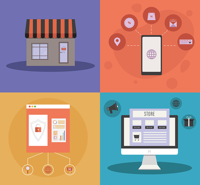
eCommerce
Ecommerce, or electronic commerce, refers to transactions conducted via the internet. Every time individuals and companies are buying or selling products and services online they’re engaging in ecommerce.

Influencer Marketing
Influencer marketing is a type of social media marketing that uses endorsements and product mentions from influencers–individuals who have a dedicated social following and are viewed as experts within their niche.
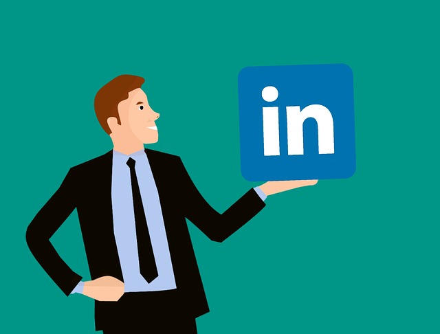
LinkedIn Marketing
LinkedIn offers a lot of opportunities and is the ideal resource for B2B marketing. But without the right knowledge, it becomes just another time-sucking social network. Next time you're on LinkedIn, spend at least thirty minutes doing some advanced searches or group searches, and see if you don't come up with at least five prospects.

Marketing Automation
Marketing automation is technology that manages marketing processes and multifunctional campaigns, across multiple channels, automatically. With marketing automation, businesses can target customers with automated messages across email, web, social, and text. Messages are sent automatically, according to sets of instructions called workflows.

Non-Profit Marketing
Nonprofit marketing is the use of marketing tactics by a nonprofit organization. Marketing goals may include promoting the organization and its message, raising funds, encouraging membership, engaging volunteers, and driving political or social change
PR Marketing
A public relations (PR) strategy may play a key role in an organization's promotional strategy. A planned approach to leveraging public relations opportunities can be just as important as advertising and sales promotions. Public relations is one of the most effective methods to communicate and relate to the market.

Twitter Marketing
With more than 145 million active daily users, Twitter should be a part of your marketing strategy. It's the fifth most popular social media network, and it'sis a gold mine of customer insights and opportunities to build your brand, drive sales and win fans.
Advertising
Marketing communication that employs an openly sponsored, non-personal message to promote or sell a product, service or idea.

B2C Marketing
Business-to-customer marketing refers to the tactics and strategies a company uses to promote its products and services to individual people.

Content Marketing
Content marketing is a form of marketing focused on creating, publishing, and distributing content for a targeted audience online.
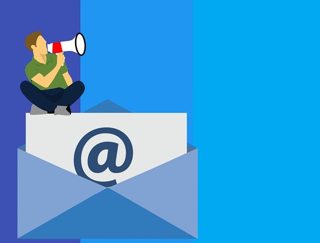
Email Marketing
Email marketing it involves using email to send advertisements, request business, or solicit sales or donations.

Instagram Marketing
With an advertising audience of more than 1.16 billion people, Instagram offers dramatic reach for brands. And the potential reach of Instagram marketing has grown substantially this year—increasing by 76 million people in just the last quarter.

Local Marketing
Local marketing—also referred to as local store marketing or neighborhood marketing—specifically targets the community around a physical store or restaurant. Promotional messages are directed to the local population, rather than the mass market

Mobile Marketing
Mobile marketing is a multi-channel, digital marketing strategy aimed at reaching a target audience on their smartphones, tablets, and/or other mobile devices, via websites, email, SMS and MMS, social media, and apps.

Neuro Marketing
Neuromarketing Meaning: Essentially, neuromarketing is designing your content, website, etc. to ellicit particular neurological reactions that are associated with buying or emotions linked to buying. Using neuromarketing, you can rethink your strategies and create smarter marketing that will boost the effectiveness of your efforts.
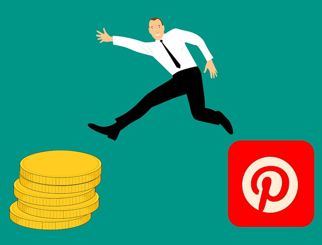
Pinterest Marketing
Pinterest is a goldmine when it comes to marketing. But finding success with your Pinterest marketing strategy goes beyond just having a great profile image and company description for your Pinterest business account. Making Pinterest marketing work boils down to having a clear strategy that resonates with your business goals.

Sales
Sales are activities related to selling or the number of goods sold in a given targeted time period. The delivery of a service for a cost is also considered a sale. The seller, or the provider of the goods or services, completes a sale in response to an acquisition, appropriation, requisition, or a direct interaction with the buyer at the point of sale
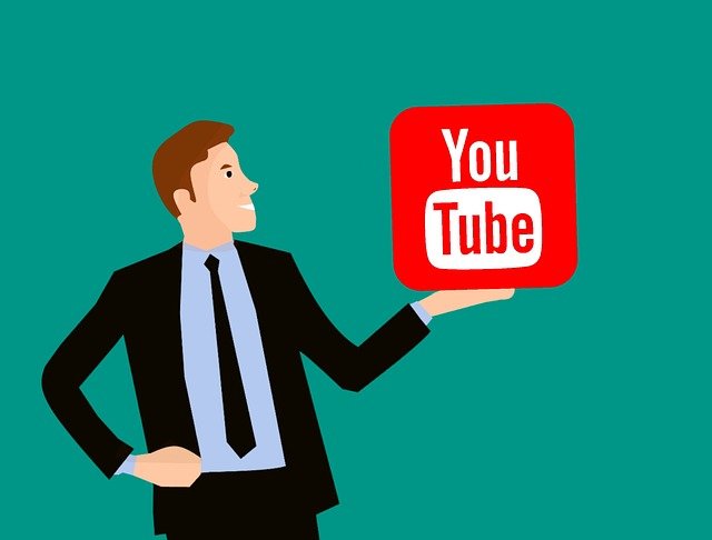
YouTube Marketing
YouTube marketing is often overlooked by social media marketers. Some think YouTube counts as a social media network. Others see it as more of an online video platform. Either way, there are countless marketing opportunities on YouTube—especially if your audience is on the platform and your competitors aren't.

Adwords Marketing
Google AdWords' system is where advertisers pay to display brief advertisements based on cookies and keywords.

Book Marketing
By following in the footsteps of those who have succeeded before you, you can create a focused and effective book marketing plan that will get people snatching up your masterpiece.
CRM Marketing
Customer Relationship Management (CRM) and Marketing CRM leverages and amplifies customer base of an organization through efficacious and efficient marketing.
Facebook Marketing
Refers to creating and actively using a Facebook page or Group as a communications channel to maintain contact with and attract customers.

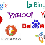
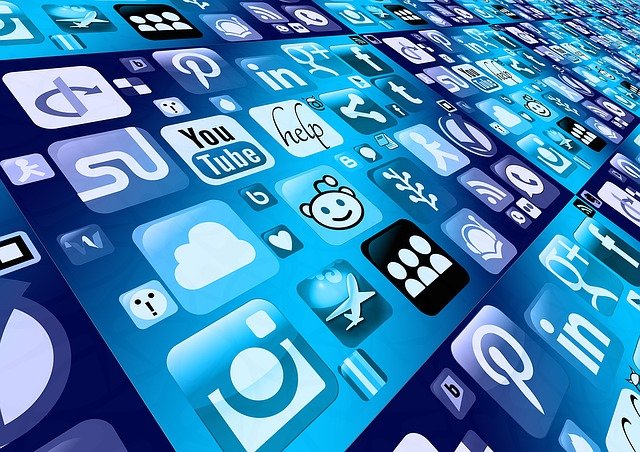
Internet Marketing
Online marketing, also known as internet marketing or web advertising, is a form of marketing that uses the internet to deliver promotional messages to customers through digital channels such as search engines, email, websites, and social media.

Market Research
Email marketing it involves using email to send advertisements, request business, or solicit sales or donations.

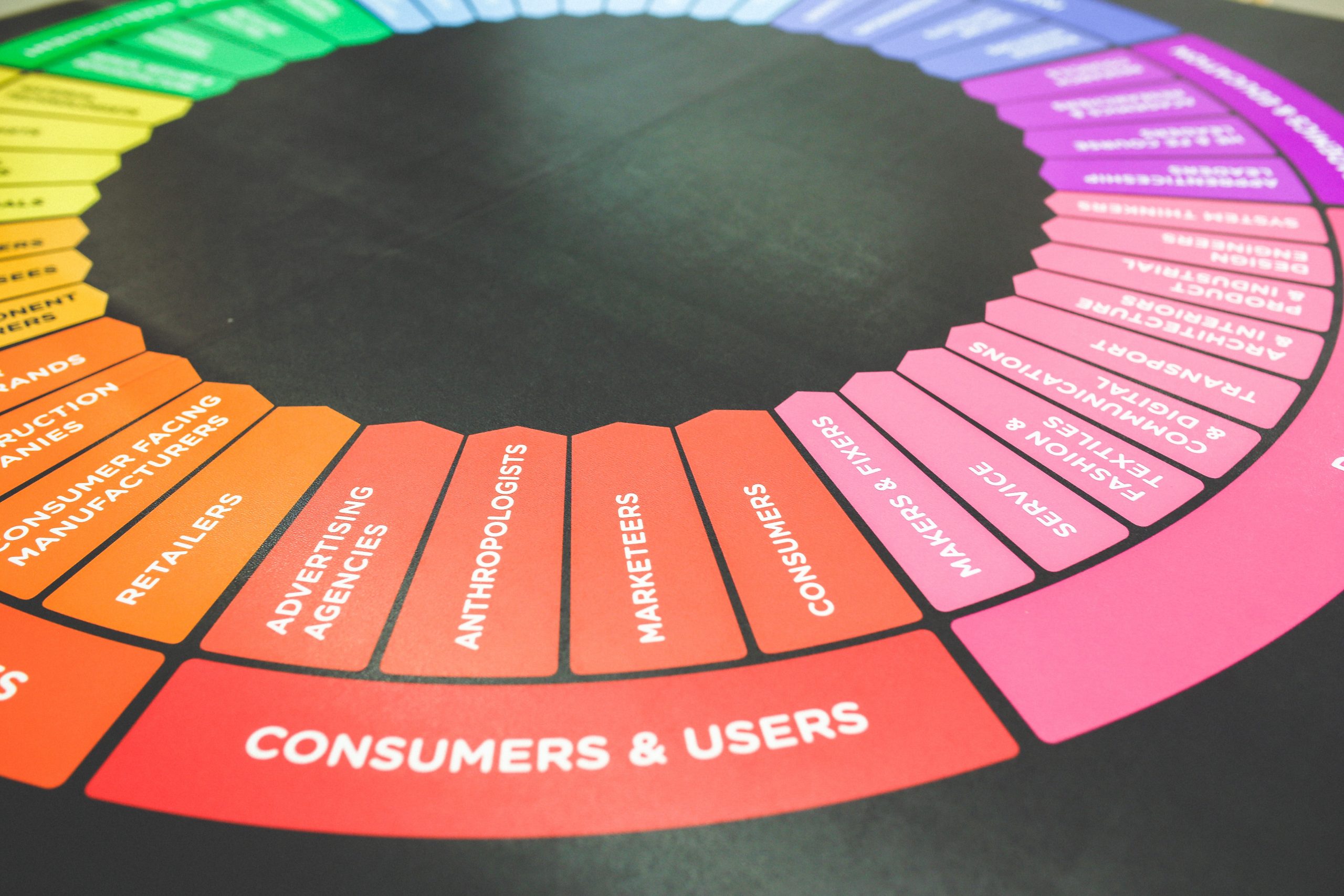
Marketing
Marketing refers to activities a company undertakes to promote the buying or selling of a product, service, or good. In 2017, The New York Times described it as "the art of telling stories so enthralling that people lose track of their wallets".
Network Marketing
Multi-level marketing, also called network marketing or pyramid selling, is a controversial marketing strategy for the sale of products or services where the revenue of the MLM company is derived from a non-salaried workforce selling the company's products or services.

PPC Marketing
PPC stands for pay-per-click, a model of internet marketing in which advertisers pay a fee each time one of their ads is clicked. Essentially, it's a way of buying visits to your site, rather than attempting to "earn" those visits organically. Search engine advertising is one of the most popular forms of PPC.
Social Marketing
Small Business Marketing Marketing is meant to raise brand awareness and build a pipeline of qualified leads that turn into sales. With a small business, getting the word out can be challenging due to less visibility and lack of resources (like budget or time).

Small Business
Email marketing it involves using email to send advertisements, request business, or solicit sales or donations.

Video Marketing
Video marketing is using videos to promote and market your product or service, increase engagement on your digital and social channels, educate your consumers and customers, and reach your audience with a new medium.