In 2024, we analyzed 26,270 Sleeknote popup campaigns to determine how to build a high-converting website popup in 2024.
Here’s what we learned:
What Is The Average Conversion Rate for a Popup?
Despite the ongoing changes in the marketing landscape, popups continue to work for businesses that leverage them.
Our data shows that the average Sleeknote campaign conversion rate is 4.13%.

But what is a “conversion”? And what are the variables that influence that number?
Read on to learn our seven most surprising findings (and how to build a high-converting popup).
1. Use Gamified Popups
When we think about popups, we tend to think of the following scenario:
We visit a site and, within seconds, see a popup asking for our name and email address.
Sometimes, a brand asks for a name and email in exchange for a discount. But more often than not, it’s an afterthought, pushing instead for visitors to “get updates” (i.e., join its newsletter).
In 2024, we consider such an approach the “old way” of using popups. The relationship is transactional; the visitor trades their details for an incentive.
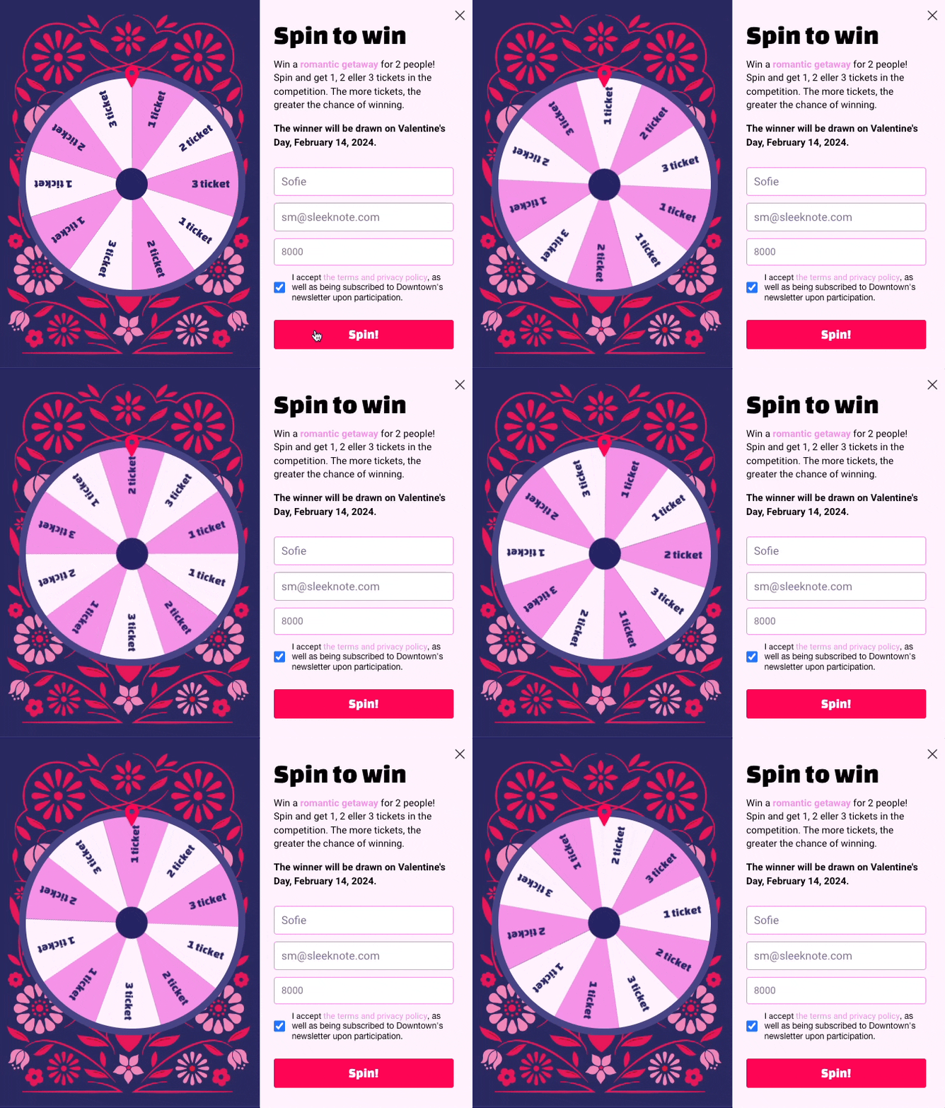
By contrast, the “new way” of using popups is relational. Here, the visitor plays for the incentive, such as “spinning” a wheel or completing a quiz.
The change to “gamify” the opt-in experience drives a level of engagement we haven’t seen before, as reflected in the numbers below.
Here’s an example from one of our customers, Danish travel retailer Take Offer, combining a giveaway with a “wheel popup” to drive email signups:
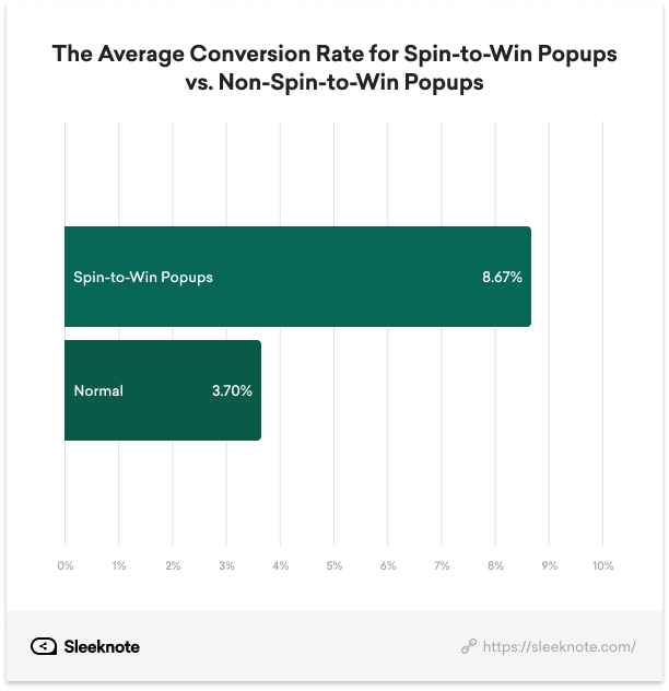
We saw popups using spin-to-win (8.67%) outperformed popups that did not use spin-to-win (3.70%) by a whopping 132.32%.
Aside from spin-to-win, we looked at two other gamified popup variations, each with surprising conclusions.
i. Use Daily Offers
Offering visitors a sale on a product for 24 hours is a popular tactic for collecting emails during specific seasonal periods like Easter, Christmas, and Black Week.
Rather than offering a 10% discount to all visitors (which shoppers now expect in industries like ecommerce), the brand gamifies the visitor’s experience.
(The visitor thinks to themselves, “Should I opt in now? Or, return tomorrow and compete for a potentially better, more compelling offer?)
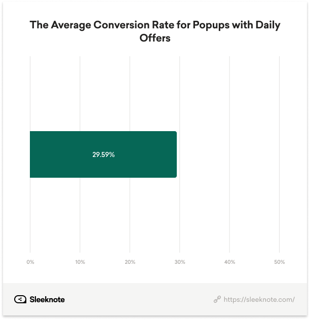
The data shows that people love daily offers. We found that the average conversion rate for popups with daily offers was 29.59%.
One approach to using daily offers, as shown in the example below, is asking the visitor for their name and email and then revealing the day’s offer in the second step:
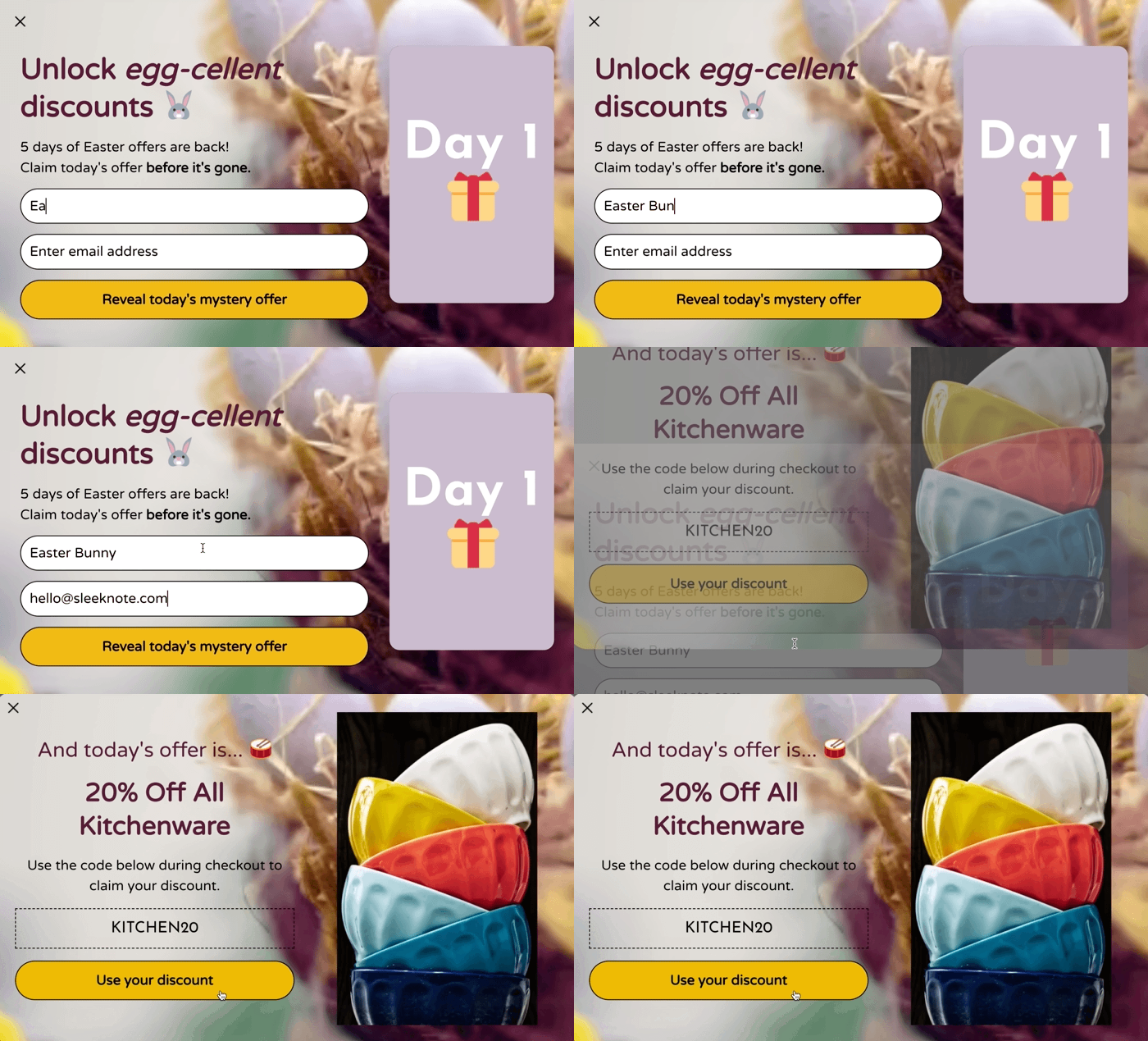
(As an aside, Sleeknote makes it simple to run daily offers. Set the dates and add the copy, images, coupon codes, and links for each offer. Then, we update the campaign with the day’s offer each day it goes live.)
Lesson:
Use daily offers to collect more details from readers, send better, more targeted emails, and leave visitors wanting to return to your site for new offers.
ii. Use Quizzes
Prevalent in ecommerce, quizzes ask website visitors questions about their interests and recommend potential products based on their answers.
The visitor gets a personalized experience on-site, and the brand collects valuable details from its subscribers, which it can use to send better, more targeted emails.
The problem, however, is once shoppers leave the homepage (where the invitation to take a quiz is often featured), brands miss out on using quizzes to their full potential.
To solve that problem, marketers can instead use onsite quizzes—popups with quizzes embedded—and target specific pages where it makes the most sense for the visitor.
For instance, if a visitor is on a product page, the brand can show a popup offering to help them find the right product (without leaving the page).
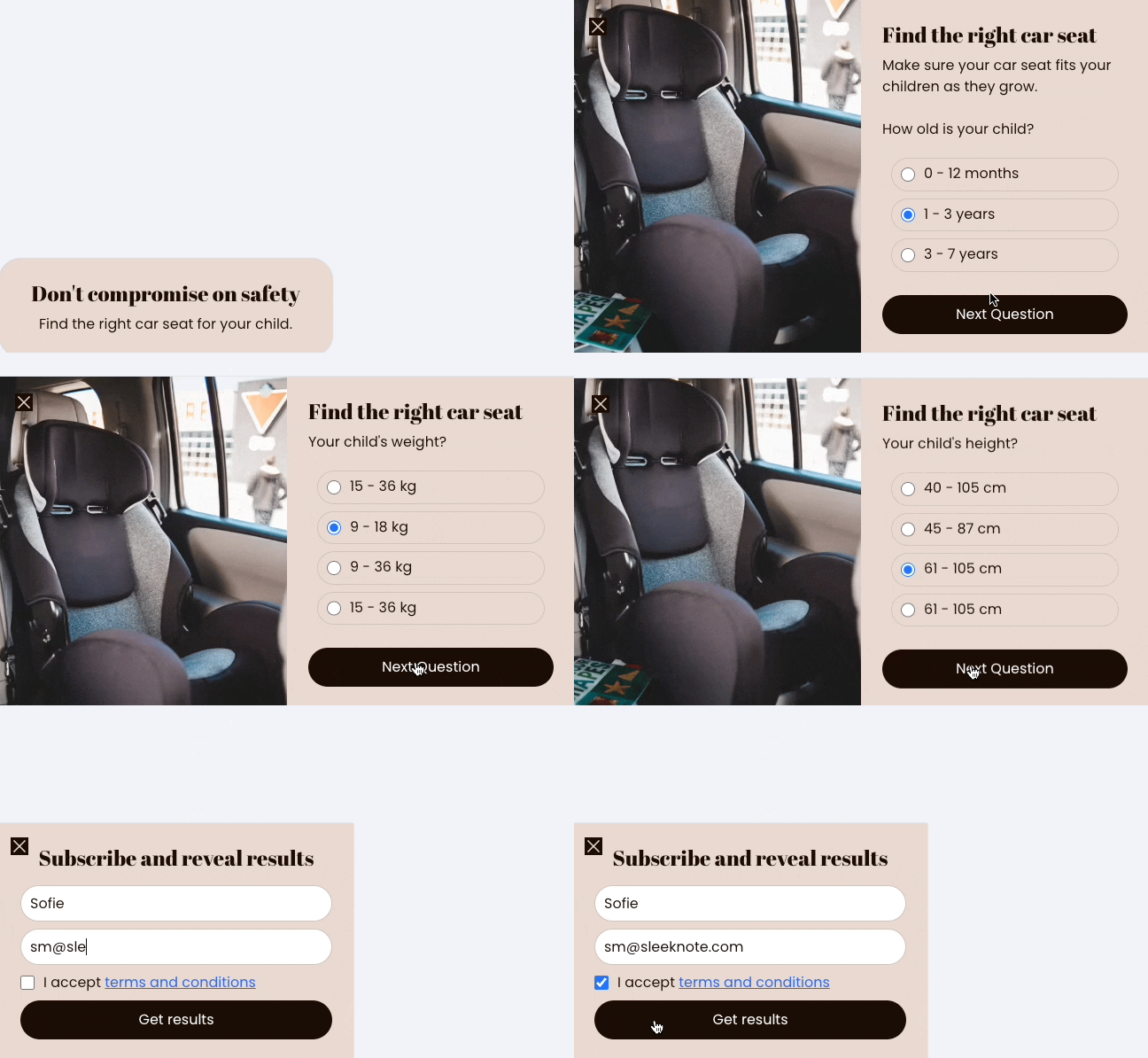
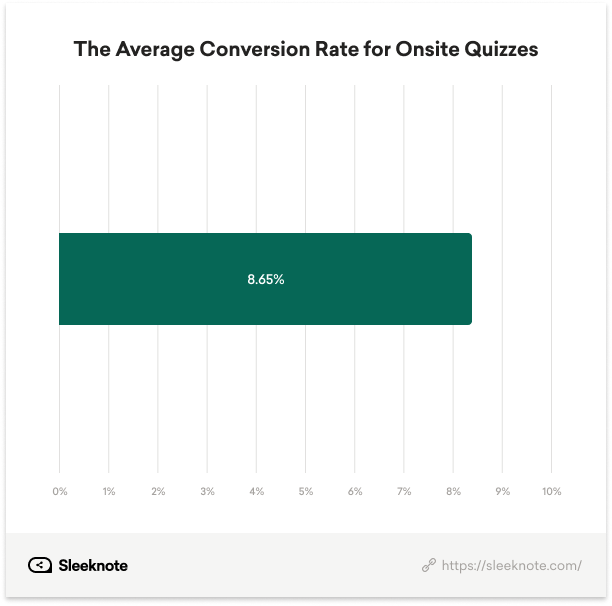
We found the average conversion rate for onsite quizzes was 8.65%.
Lesson:
Popups that encourage active participation from the shopper perform much better than those that don’t. Invite users to spin a wheel, take a quiz, or opt into a daily deal to drive higher email conversions.
2. Use a Timer-Led Trigger
Some marketers use popups with a timer-led trigger, which shows the popup to the visitor after a certain number of seconds.
Others use a scroll-led trigger, which shows after the visitor has scrolled a certain percentage of the page.
(And some show a popup the second a visitor lands on the website for the first time, which serves no one.)
But which is better? And which is the optimal number to use when setting a trigger?
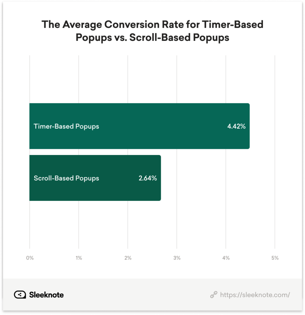
We found that timer-led triggers (4.42%) outperform scroll-based triggers (2.64%) by 67.42% and that 6 seconds is the optimal number of seconds.
Lesson:
Use timer-led triggers and set popups to show after 6 seconds to give visitors time to browse the current page.
3. Optimize on Mobile
Google doesn’t like intrusive interstitials. You know that. You also know users spend more time on mobile than on desktop.
The question is: do mobile users convert as well as desktop users, if not better?
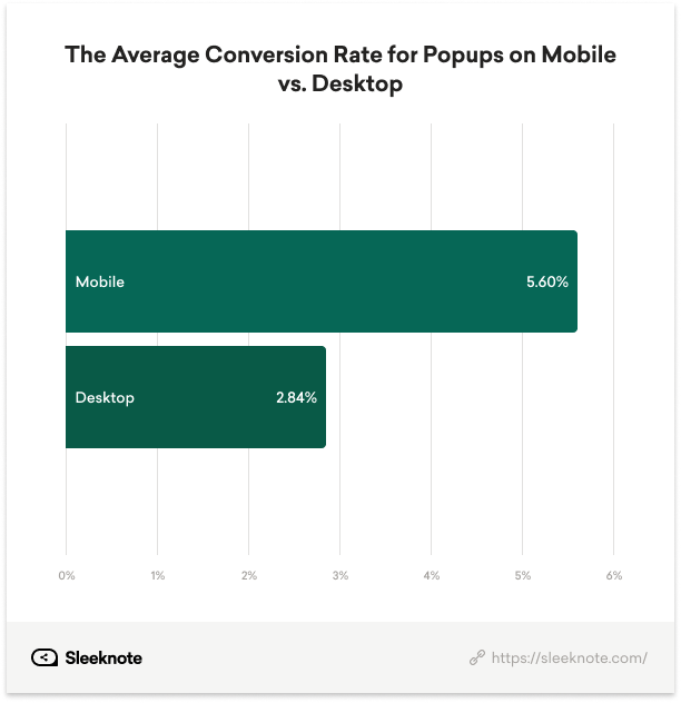
To our surprise, mobile popups (5.60%) outperform desktop popups (2.86%) by a whopping 97.18%.
It’s worth mentioning here, however, that no two conversions are alike, and a conversion goal might change from one device to another.
At Sleeknote, for instance, we want to capture email subscribers on mobile and drive free trials on desktop (given the latter’s UX is better).
As such, we have campaigns that reflect the above, each with its own device-specific goal.
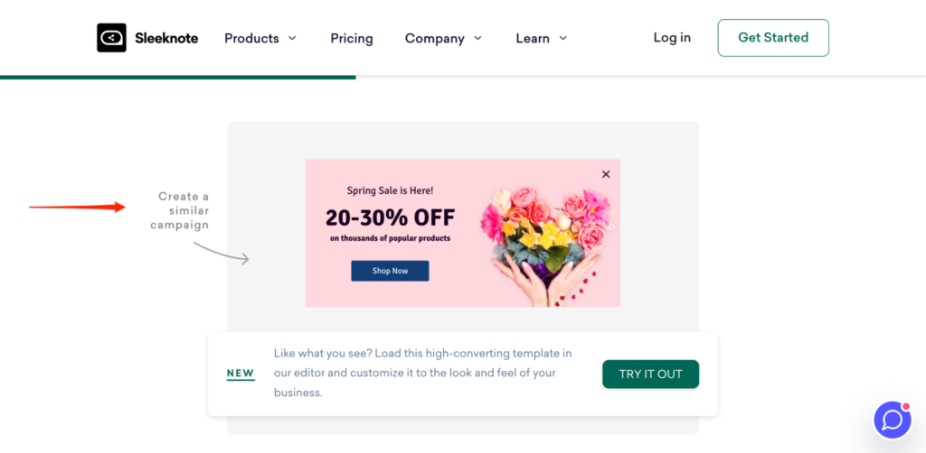
On our Recipes page, we want desktop visitors to start a free trial by clicking one of our pre-made popup templates.
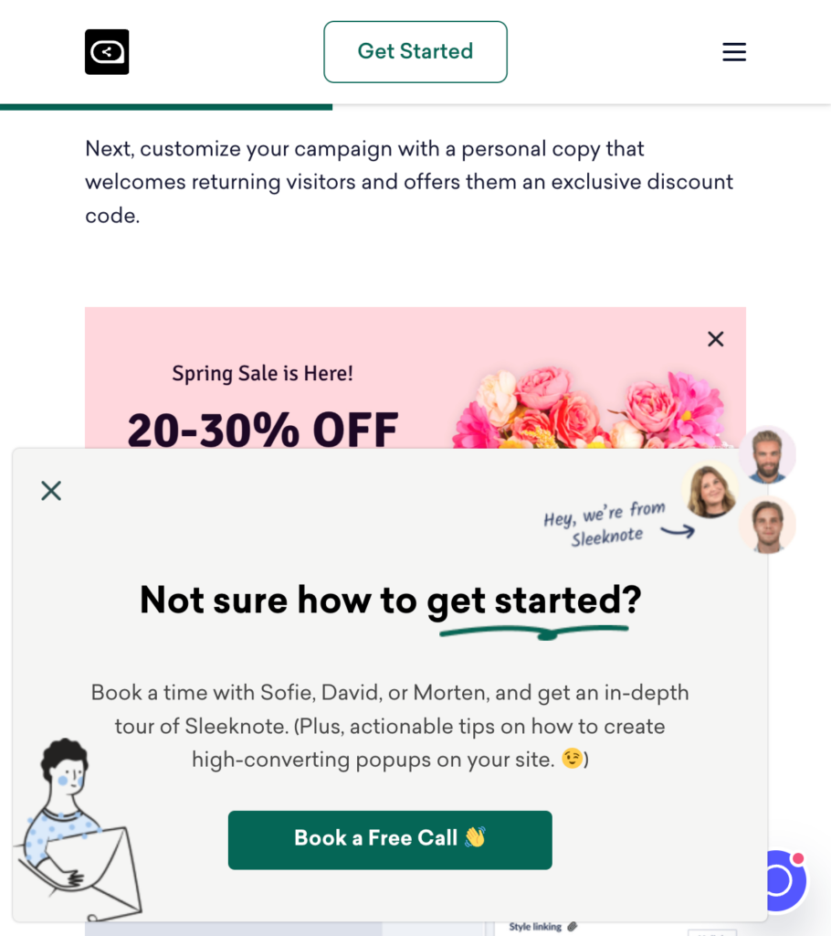
But on mobile, we want visitors to book a free demo.
So, to help them do that, we show a teaser, inviting the user to learn more about our product before inviting them to book a free call.
Yes, making one popup for both devices is quicker and easier. Still, given that few marketers capitalize on desktop and mobile traffic to their fullest extent, making that second mobile campaign is well worth the time and effort.
Lesson:
Show popups on mobile, but make them device-specific depending on your conversion goals.
4. Use Multistep Popups
Internet privacy has become a hot topic in recent years.
With the death of third-party cookies, the birth of Consent Mode 2.0, and other privacy-related updates, more marketers are seeking alternate solutions to collecting first-party data from site visitors.
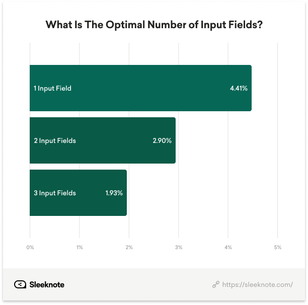
The problem, as CRO marketers in particular can attest to, is asking for more details from visitors—in other words, adding more input fields—can lead to fewer conversions.
We can confirm this as our research shows that conversions drop from 4.41% to 2.90% when going from one input to two and 2.90% to 1.93% from two to three.
But not all hope is lost.
When using a multistep popup that asks for the visitor’s email in the first step and more details in the second step, marketers can see that 76 percent of visitors input more information.
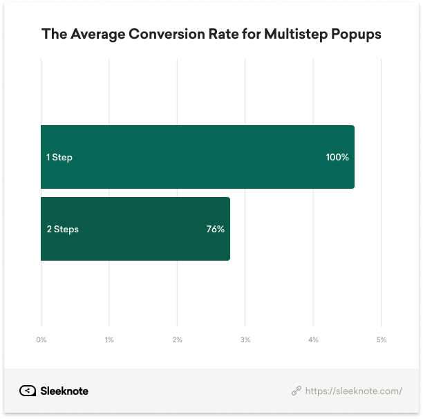
To enrich lead data without compromising conversions, consider using a multistep popup. In the first step, ask for the visitor’s email. Then, in the second step, ask for extra details, such as their interests or preferences.
You can later use this information and other details collected in the second step to send better-targeted emails and drive more revenue per subscriber.

Lesson:
Use multistep popups to collect more details from website visitors without seeing a conversion drop.
5. Use an Image
It’s no secret that images increase conversions. Showcasing a product on a product page, complete with a model demonstrating said product, moves shoppers to purchase.
But what about popups? Does adding an image move browsers to input their details or click-through to learn more about a product?
As it turns out, it does.
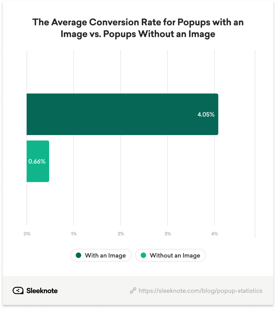
We found that campaigns with an image (4.05%) outperformed popups without an image (0.66%) by 513.63%.
It’s important to mention here that images are not limited to products.
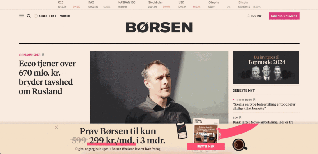
Some of our favorite popup examples, including Børsen promoting its paid subscription as per the example below, feature an image promoting the offer.
Lesson:
To increase a popup’s conversion rate, use an image that complements the popup’s message. (You’ll go even further when using an image for the popup and teaser.)
6. Use a Countdown Timer
Countdown timers can also increase conversions when combined with a genuine, time-sensitive promotion.
It doesn’t matter whether it’s a seasonal campaign, a Black Friday promotion, or a limited-time offer—the fear of missing out moves shoppers to purchase.
While urgency is common in email campaigns and on landing pages, we wondered whether creating urgency in a popup had a similar effect.
However, rather than look at popups that create urgency in their copy, we looked at another, more underused element: a countdown timer.
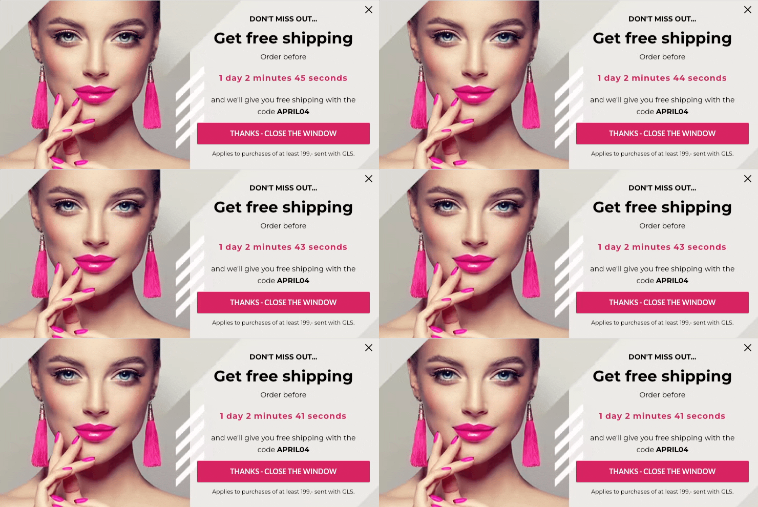
We found that popups with a countdown timer (5.17%) convert better than campaigns without a countdown timer (4.12%) by 25.48%.
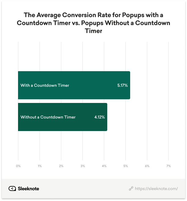
Marketing tactics change over time. But “weapons of persuasion” that move us to action? Those will never change. Give visitors a much-needed visual reminder (when it makes sense) to drive higher onsite conversions.
Lesson:
When running a time-sensitive campaign, include a countdown timer to remind users of the campaign’s deadline.
7. Use a Teaser
Timing is everything when it comes to popups.
Showing a popup too soon causes a visitor to close it without thinking while showing it too late increases the risk of missing out on a potential conversion.
As discussed above, using a timer-led trigger solves the issue for most marketers—waiting 6 seconds gives readers time to decide whether to join the brand’s email list.
Still, the best time to engage visitors is when they decide to see a popup, such as with a teaser that previews the popup’s content.
The teaser is often visible in the screen’s bottom-left or right-hand corner, reminding visitors there’s an offer for them if/when they’re ready to learn more.
Here’s an example from a Sleeknote customer, WoodUpp.

We found that popups with a teaser (4.54%) convert better than campaigns without a teaser (2.74%) by 65.69 percent.
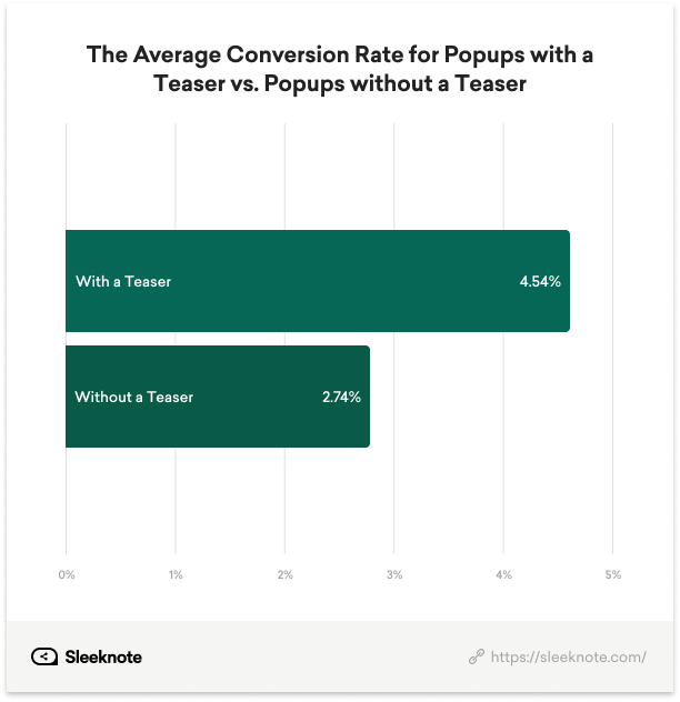
Sometimes, a sneak preview is all needed to nudge skeptical visitors to opt in or make a purchase. If not, the visitor can reopen the popup when the offer is most needed (such as adding a code before checking out).
Lesson:
Use a teaser to preview a popup’s message to increase conversions and reengage visitors when needed.
Conclusion
If you’re already using popups, this guide will teach you how to use them to their full advantage.
And if you’re not, there’s no better time to get started than now.
You can try Sleeknote for free for seven days and get unlimited access to all our features (including those mentioned in the guide).
The post Do Popups Still Work in 2024? Here’s What The Data Tell Us (Original Research) appeared first on Sleeknote.

