
Hello and welcome to The GTM Newsletter – read by over 50,000 revenue professionals weekly to scale their companies and careers. GTMnow is the media extension of GTMfund – sharing insight on go-to-market from working with hundreds of portfolio companies backed by over 350 of the best in the game executive operators who have been there, done that at the world’s fastest growing SaaS companies.
This week’s newsletter is brought to you by Demandbase.
Demandbase helps B2B companies hit their revenue goals using fewer resources by using the power of AI to identify and engage the accounts and buying groups most likely to purchase. Their account-based technology unites sales and marketing teams around insights that you can understand and facilitates quick actions across systems and channels to deliver big wins. It’s flexible, scalable ABM built for you.

Covered today:
-
The story behind how and why Shopify shifted KPIs used to measure user onboarding.
-
More on GTM for your eardrums.
-
More on GTM for your eyeballs.
-
Startups to watch.
-
Hottest GTM jobs of the week.
-
GTM industry events.
User onboarding is the linchpin of the customer journey. It’s similar to making a first impression where eye contact, a handshake, and a smile significantly shape initial perceptions and future interactions.
User onboarding sets the tone for the relationship to come. Often, it’s the customer’s first real interaction with a product post-purchase. A positive onboarding experience can set a constructive tone for the user’s entire lifecycle with the product, fostering trust and engagement.
This is true both for both sales-led motions and product-led motions.
For product-led, those employing a product-led growth (PLG) motion, the process is highly data-driven with specific KPIs serving as gauges for impact and success.
With that, measuring the right metrics is key.
To help dive into a core KPI associated with user onboarding, I teamed up with product expert and user onboarding consultant, Adam Jarczyn.
Below, Adam breaks down the KPI Activation Velocity and shares the story of how Shopify adopted this KPI for user onboarding, the impact that this had, and how it can be considered for any company.
Let’s get into it.
Improving User Onboarding by shifting from Time-to-Value to Activation Velocity – a success story from Shopify
The story behind how and why Shopify shifted KPIs used to measure user onboarding 
Joining Shopify and inheriting the KPI Time-To-Value
Adam led user onboarding at Shopify. When he joined, there were 3 key challenges:
-
The team wasn’t hitting its performance targets.
-
The team reported to Revenue leaders who didn’t understand why the team was missing targets – was this a team problem? A communication problem? A management problem?
-
It was unclear what the impact was on merchants (Shopify’s customers).
The initial KPI was time-to-value (TTV). It’s the standard metric of success in the user onboarding world and describes the average amount of time it takes a user/customer to activate.
For Adam, TTV felt wrong. The KPI wasn’t rooted in any feasibility. Averages hide insights and he felt TTV couldn’t describe the nuances or uncover why the team was missing targets.
Adam, reporting to Revenue Leaders, needed to explain a) why onboarding underperformed and b) outline improvement plans. Held to sales team standards, he needed to forecast, analyze data comprehensively, and control inputs to predict monthly outcomes.
Adam’s approach was:
-
Evaluate if the TTV metric was feasible. If not, make a case for what it should be.
-
Demonstrate he could forecast Activations, project monthly targets, monitor for early warning signals, and show the team could impact customer outcomes and revenue.
Adam’s solution was to reset leadership’s understanding of baseline performance using a new metric: Activation Velocity. Applied comprehensively, Adam could answer the same questions as his sales counterparts.
What is Activation Velocity?
Activation Velocity is a metric that describes how a cohort (group) of users reaches a key onboarding milestone (Activation) over time. Below is a sample Activation Velocity chart. It shows the % of users who activate over time for five cohorts of users (January to May):
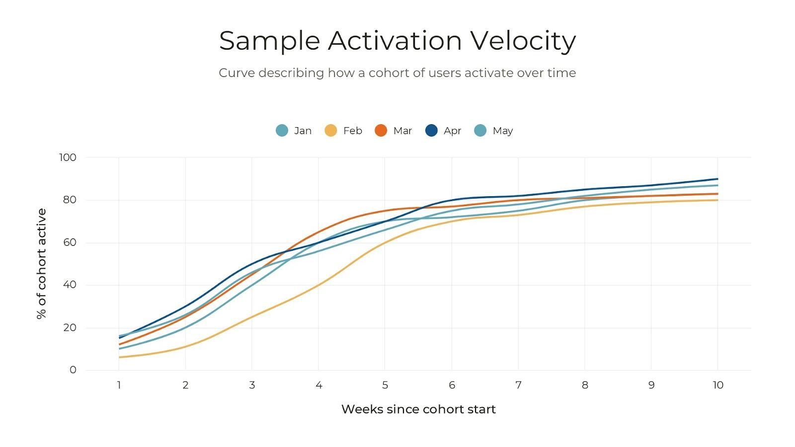
Let’s look just at January. Assume 100 users sign up for your software in January, all on Jan 1. You want to understand how those 100 users become paid users (Activated) over time.
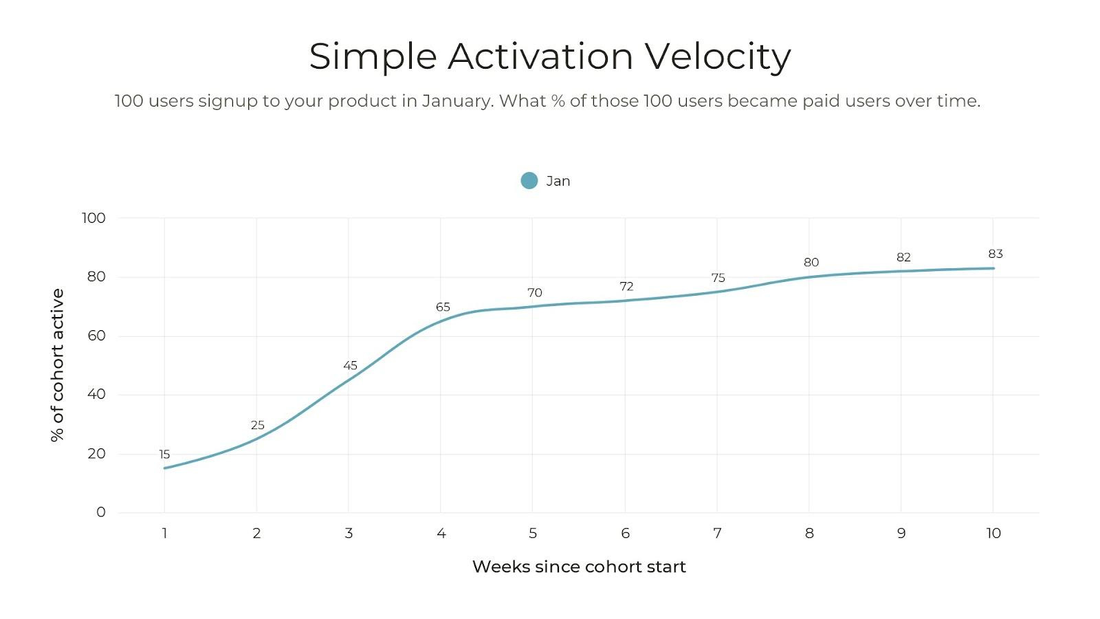
Out of 100 January sign-ups, 25% activated by January 14 (end of week 2), and 65% by January 28 (end of week 4). By week 10, 83% had activated. This pattern of activation, visible in the 5-line graph above, shows cohorts typically activate at similar rates. But the February group appears different. This will be addressed later.
Creating your first curve is relatively simple. You only need two data points for every user/customer and you can analyze in a simple spreadsheet. The data points are:
-
Start date: the date a user completed a simple signup form (e.g., email and password).
-
End date: the date the user became a paid user (activated). If a user did not activate, the date would be empty.
Why Activation Velocity is powerful
There are 5 key benefits to visualizing users/customers in cohorts using Activation Velocity:
1. Not all users are equal
Not all users will go through an onboarding at the same speed. Some are more tech-savvy. Some are experiencing a current pain and are highly motivated, Some may just be exploring.
TTV dilutes this nuance while Activation Velocity reveals this spectrum of motivations. It allows you to identify a true baseline of performance. Looking back at the 5-line example, a trend emerges about how fast a group of users activate. TTV can’t show you that.
2. Invest in the steepest part of the curve
The steepest part of the curve indicates peak momentum in onboarding. That’s your biggest window of opportunity. Helping as many users as possible in that window has the most impact on activation.
In the example below, the steepest part of the curve is between Week 1 and Week 4. A user has a 65% probability of activating in the first 4 weeks. After Week 4, there’s only an 18% probability to activate.
Focus on helping the most users in this period.
At Shopify, Adam found that the initial 6 weeks were crucial (steepest). His team decided to contact users every five days during this 6 week period. After the 6th week, the team stopped. Adam observed a significant improvement in Activation Velocity.
3. Reconsider how you invest in the flattest part of the curve
Similar to focusing on where momentum is highest, consider the investment in low-momentum (flat) periods. For instance, in the graph below, after week 4, activation probability drops to 18%. Initiatives like win-back campaigns or assisting users older than 4 weeks may require high effort for low-probability gains.

At Shopify, after Week 6, Adam’s team stopped their 5-day outreach program. They focused on what they could to make the best possible experience for the first 6weeks of usage.
4. Using Activation Velocity for early detection
Time-to-value is a lagging metric. For example, if your TTV benchmark is 60 days, you need to wait at least 60 days to know if your cohort hit that benchmark. That’s way too long to wait. Using Activation Velocity, you get early detection.
Look at the graph above. Users who signed up in February lag behind by week 2 compared to January. What caused this? Was there a product or marketing change? Market shifts? Seasonal factors in February?
At Shopify, Adam used this approach to quickly identify troubled cohorts. He could dig in early to understand why that cohort was underperforming and course correct.
5. Your leadership team will understand
Activation Velocity made it easy for Adam’s leadership to understand onboarding performance. It was simple to spot trouble areas or areas of improvement. The faster cohorts activated (steep), and the higher the % of a cohort activated (how high the line plateaued), the more revenue for the business. With this tool, Adam could tell the story of onboarding, make a case for the team’s growth, and shift the leadership perspective that onboarding is a revenue driver, not a cost center.
Optimizing using activation velocity
Here are a few ways Adam applied Activation Velocity to optimize at Shopify:
1. Scaling onboarding
The onboarding team initially relied on human-led onboarding. However, sales growth outpaced their capacity, prompting Adam to test a content-led approach. He took a segment of users and dripped them with content. Using Activation Velocity, he could compare the performance of human-led vs. content-led.
The results: customers in the content-led journey activated faster and the approach was materially more scalable.
2. Finding blockers in an onboarding journey
Activation Velocity curves need just two dates: a start date and an end date. Adam replaced the sign-up as the start date with the date when a user first used a specific product feature. The end date remained unchanged. This adjustment allowed Adam to assess the correlation between a product action and Activation.
-
A flat curve suggests users are stuck, either due to a prolonged gap between a product action and activation or a low correlation between them.
-
A steep curve implies the product action is critical for activation or occurs at the end of the onboarding experience.
Adam recommends using the above approach to find areas of onboarding delay.
3. Updating the definition of Activation to improve retention
Don’t dwell on defining activation too long. As onboarding improves, you’ll naturally wonder, “What do users do after they activate?” This is where great onboarding improves retention. For instance, if you’re satisfied with trial-to-paid conversion, consider updating activation to trial-to-three-month retention and follow the same approach to improve.
Experiment with Activation Velocity
Starting with Activation Velocity is straightforward, requiring minimal data to gain insights into your onboarding performance. Like any growth initiative, it’s an iterative process. Begin by understanding your baseline and gradually collect more data on feature usage or other user interactions. This allows for creative optimization.
Once optimized, broaden your focus by refining your Activation definition.
Activation Velocity is a great way to understand and communicate the performance and impact of onboarding.
 More for your eardrums:
Subscribe to The GTM Podcast on Apple Podcasts or Spotify.
The latest episode features Linda Lian, Co-Founder and CEO at Common Room. Common Room is the all-in-one customer intelligence platform that automatically surfaces signals across 30+ channels, reveals the person and account behind the signal, and automates actions like email messaging and team alerts. Linda founded Common Room in 2020 to unlock siloed, previously untrackable signals to transform how organizations connect with people. Before Common Room, Linda led product marketing for serverless computing at Amazon Web Services, where she saw firsthand the impact connected data and person-level insights had on accelerating product adoption, earning new customers, and expanding account revenue.
You’ll learn about operationalizing customer intelligence, the evolution of customer intelligence from intent data to signal-based selling, unifying siloed data to enable a 360-degree view of the customer, strategies for recruiting exceptional talent and building a customer-centric culture, and more.
Listen wherever you get your podcasts by searching “The GTM Podcast.”
 More for your eyeballs:
Pavilion dropped the ‘50 CMOs to Watch’ list. There are some incredible leaders in it worth following.
Sendoso shared 3 of their ‘Top GTM Bets for 2024’. In summary:
-
Unique, personalized events.
-
Programmatic, AI-enhanced outbound.
-
LinkedIn for demand creation AND capture.
Crossbeams’ CEO and Co-Founder, Bob Moore’s new book Ecosystem-Led Growth became a national bestseller and was featured in Times Square. The wave that it has created through the industry is astronomical and we have even had founders and partners of GTMfund commenting that they have seen the physical book on the desks of other companies while attending in person meetings.
 Startups to watch:
UserHub – UserHub announced a $3.2M pre-seed round. The company is remixing User Management and Subscription Management into a single platform, with a mission to make modern and scalable monetization capabilities attainable for software businesses of all sizes. The B2B platform empowers SaaS vendors to manage users, subscriptions, and pricing in one place. The technology works alongside authentication providers like Auth0 and billing systems like Stripe so SaaS companies can quickly integrate.
 Hottest GTM jobs of the week:
-
Founding Growth at Pocus (Remote – US)
-
Account Executive, Velocity at Vanta (Remote – US)
-
Enterprise Account Executive at Atlan (NYC – Remote)
-
Director of Growth Marketing at Census (San Francisco)
-
Revenue Operations Manager at Weaviate (Remote)
See more top GTM jobs on the GTMfund Job Board.
 GTM industry events
Upcoming go-to-market events you won’t want to miss:
-
May 15-16: The ELG Conference (Austin, TX)
-
June 6: CRO Summit by Pavilion (Boston, MA)
That’s it, that’s all.
Having recently made a handful of software purchases with user onboarding experiences ranging from exceptional to below average, the impact of this stage has been particularly evident.
It sets the tone for the relationship, much like the first impression you make when meeting someone new.
I hope this not only informs your go-to-market strategy but also inspires you to be particularly mindful of the importance of that initial encounter whenever you meet someone new.
Barker 
If this newsletter was forwarded to you, sign up here to get the newsletter every week.
The post Activation Velocity: The KPI You Need To be Tracking in User Onboarding appeared first on GTMnow.