In this article, we’ll explore how better visual communication can help you connect with employees, customers and prospects—and share expert tips on how your company can level up.
What is visual communication?
Visual communication is the art of using visual elements strategically to grab an audience’s attention, clearly convey important information in a way that sticks, and usually spark behavior change. Common components of visual communication, especially when used in digital communications, include text, images, data, and video content.
Here are some common examples of visual communication for business communications.
Visual communication examples
Animated videos
Animated videos are a rich multimedia format that can include visual elements like human and animal characters, kinetic (moving) text, and motion graphics.
Styles can vary widely, from a simple, black and white “whiteboard” look to colorful and detailed.
AI-generated videos
Today’s AI-powered video tools can now create videos for you in seconds based on text prompts or static images you provide.
GIFs
GIFs are looping images that often sometimes include a short tagline overlaid on the image. They’re often used to communicate funny content or as a reaction to something. They’re used regularly across social media channels, in email, and on internal communications platforms like Slack.

Screen recording
Screen recordings are videos showing your desktop or a software’s user interface, helpful for demonstrating workflows and processes.
Images
Images are visual representations of something, like a doodle, a photograph, or a diagram.
Infographics
Infographics are visual representations of information designed to make data easily understandable at a glance. They combine graphics, charts, and minimal text to convey complex information quickly and clearly.
Data visualizations
Data visualizations are graphical representations of information and data, meant to provide an accessible way to see and understand trends, outliers, and patterns. An infographic is a popular example of data visualization.
Stock footage
Stock footage refers to photorealistic images and videos that are broadly available for widespread use.
Webcam video
Webcam videos are recordings created using the camera built into your computer. They’re usually “talking head” style, and can capture one speaker or many (like a replay of a meeting).
Benefits of visual communication in business today
Business communication is ultimately about convincing an audience to take action or change behavior: watch out for phishing emails, learn a new skill, enroll in a new benefits program, sign up for a free trial — you get the idea. And the keys to success change with the times.
In recent years, our experience as online consumers has created expectations for visual communication that spill into our professional lives.
We expect communications to be relevant to us (what else should I watch? What do other people like me buy?).
We expect content to be engaging and entertaining, thanks in part to social media — if it doesn’t draw us in, we can easily scroll on to something that does.
And because so much of our online interactions take place on smartphones, we favor more compact, visual forms of communication that pack a meaningful punch: like emojis, memes, and especially videos.
The great news is, you can take advantage of these general visual communication preferences to more effectively change behavior and inspire action in any business audience — whether they’re employees, customers, partners, or prospects. It’s already catching on: About a third of global business leaders surveyed (32%) have an increased desire for communicating using visuals, according to Canva’s 2023 Visual Economy Report.
When we use visual communication well, we get two major benefits:
Better engagement
Good visual communication content catches our audiences’ eyes and draws them in for reflection, because it’s relevant to them.
Improved information retention
Good visual communication imprints information on our audience, so they can recall it and apply it later.
Both of these benefits make it more likely that our content will inspire action and change behavior.
So whether you’re creating content for external communications — like landing pages on your company’s website or assets for social media — or internal communications — presentations, training videos, and GIFs — thinking strategically about how you can apply good visual communication practices will help you deliver better results. Here are a few tips to keep in mind.
Tips for better visual communication
Tailor visuals to your audience
Audiences today expect content and communications to be relevant to them, and visuals are no exception: they want to see themselves and their interests reflected. With the power of AI, it has become easier than ever to segment and customize your content by audience.
The extra time you spend getting to know your audience — through research, surveys, conversations — and tailoring content for them is worth it for the positive impact on engagement. Here are a few examples.
L&D
L&D teams can create content specific to employees’ roles or departments. The L&D and change enablement teams at Whole Foods Market created templates tailored to each of the roles at their stores, down to the uniforms and terminology, so employees see themselves represented.
Including recognizable figures or references from your organization is another powerful way to boost engagement and relevance. At the Administrative Office of the Illinois Courts, training specialist Angie Kanak likes to include characters she created for each of the Illinois Supreme Court Justices that her audience instantly recognizes.
And finally, corporate branding isn’t just for external audiences. Officially branded training content signals to employees this is valuable content, created especially for them.
See how Vyond’s new Brand Management Suite makes it easy to create engaging, on-brand videos.
HR
HR pros can reinforce an inclusive company culture and make visuals more relevant by taking care to reflect the full diversity of your employee base in your content. Choose imagery that suits your geographic footprint, like your office sites and regional landmarks. Build in time and budget to translate, localize, and caption materials like videos.
Similar to the training examples above, ask yourself: where could you tailor content by role and department? Where could you include stories from recognizable employees or leaders to help bring policies and processes to life?
Marketing
In marketing, demonstrating you understand your audience is the whole point. At the brand level, it starts with asking what your competitors are doing visually — how can you stand apart?
On your website, tailoring your visuals could mean ensuring your “ideal customers” see themselves reflected in the imagery: solving problems they relate to, in settings they recognize, with your products or services.
In your email program, tailored visuals might show up as messages and email banners segmented by industry or job level, speaking to each audience’s real pain points.
From a channel perspective, it might mean you’re including captions on all of your social media video content to help ensure viewers scrolling by with sound off can read along and still grasp your message.
Sales
When you’re presenting to a customer or prospect, it’s already standard to include their company name and logo in your materials (triple-checked for accuracy, of course!). And if you’re not already, creating custom demos that address specific pain points your audience has mentioned, or you’ve found via research, can be especially effective.
Even before you get to the meeting, during outreach you can introduce yourself and showcase your product’s value proposition with a personalized overview video. Keep yourself top of mind after your conversation by sending a video message starring your own custom, self-voiced character to help prospects and customers remember and honor scheduled meeting times.
Reduce your audience’s cognitive load
No matter your department, one of the biggest challenges with communicating visually is the constant strain on our audience’s working memory, according to Connie Malamed, author of Visual Design Solutions and Visual Language for Designers.
We’re flooded with sensory information. All. Day. Long. For any information to make it into our long-term memory, it has to make its way through our limited, temporary working memory.
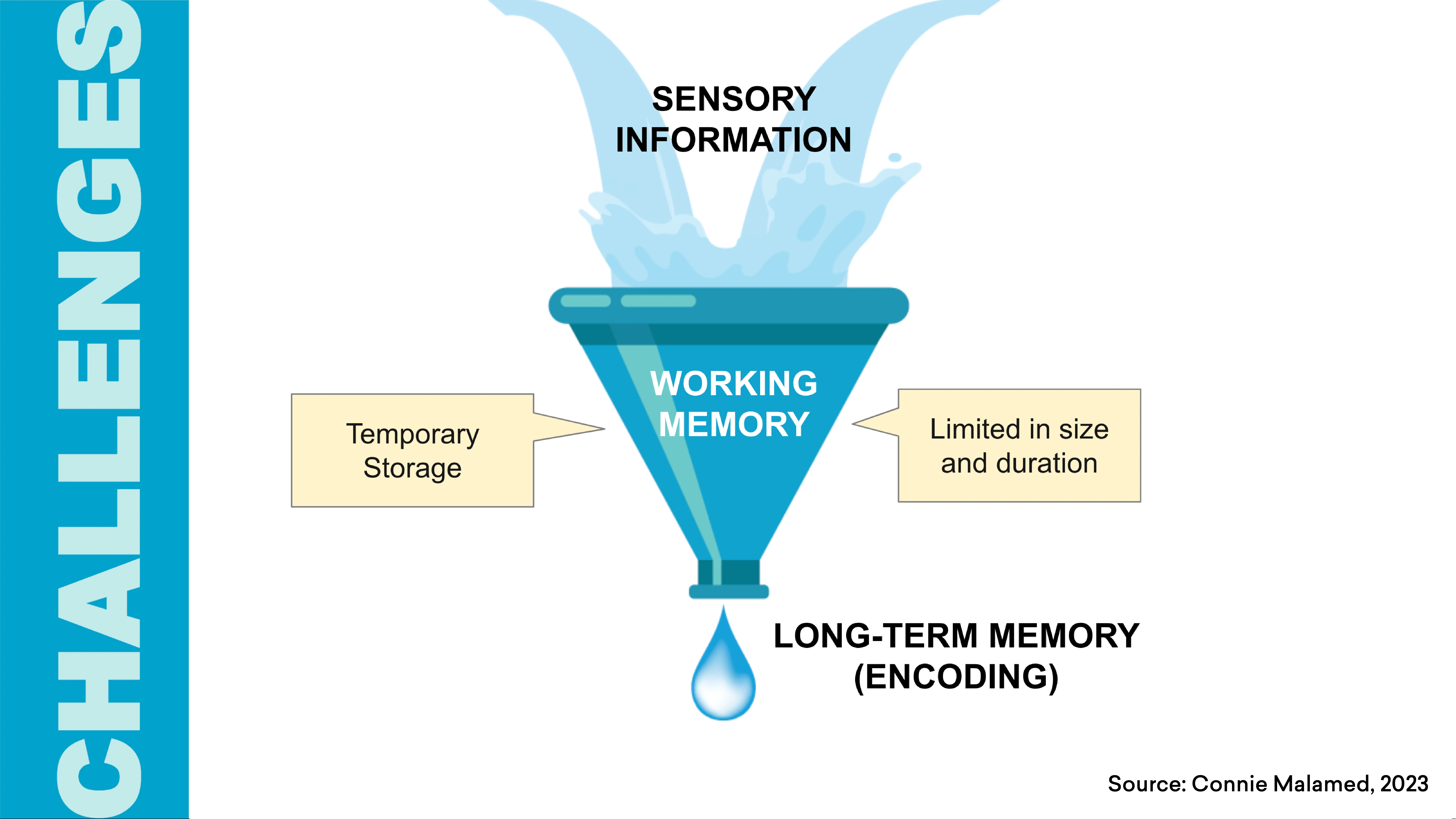
Anything we can do to help ease this “cognitive load” for our audience gives them a better chance to grasp and retain the information we’re presenting, Connie says.
Here are a few of Connie’s suggestions for reducing your audience’s cognitive load when you’re creating presentations, videos, website pages and more.
Make your graphics and text easy to process
Your content’s readability matters. Overly intricate font styles and text with low contrast (like gray text on white background) put more strain on a viewer’s cognitive load.
Using simple fonts with high contrast makes information easier to process, reduces demand on working memory, and creates a positive affect in the viewer.
Remove visual distractions
Visuals can either increase meaning and understanding for viewers or distract and confuse them. A few simple ways to dial down visual “noise” in business presentations or videos:
- Avoid placing a logo on every slide and putting text on busy backgrounds
- Remove irrelevant text, like dates and slide numbers
- Remove cutesy but irrelevant graphics
Reduce realism in your graphics
There’s a misconception that photorealistic imagery is always best, especially in learning, Connie says.
But research shows that often, reducing the realism of a graphic can help people learn more quickly: by decreasing the time it takes the viewer to visually scan, it minimizes load on the viewer’s working memory.
This means that an illustration, icon, or symbol might convey information more effectively than a photo or 3D rendering.
This is one reason animated videos — which by nature reduce realism — are such a powerful form of business communication.
Don’t split your audience’s attention
When you force your audience to process two or more different sources of information at the same time, neither of which can be understood in isolation, you’re falling prey to the “split-attention effect.”
In HR, this might show up, say, in your benefits overview video: showing an explanation on one part of the screen and a visual, such as a diagram or animation, on another. Your viewer’s attention can’t be in both places at once.
Deliver information piecemeal and guide your audience along
According to Mona Chalabi, Pulitzer Prize–winning illustrator and data visualization expert, effective visual communication delivers information bit by bit and guides your audience along, from start to finish. Applied in different business areas, this lesson could mean creating content that builds gradually (think presentations that change on a click or interactive websites) to give audiences an opportunity to digest what they’re seeing and let insights build upon each other.
Get creative about visualizing data
Data can be an influential part of your business content, helping you tell a powerful, memorable story. But a wall of numbers isn’t helpful: it’s crucial to point out why your audience should care and put numbers in context.
- Rather than writing out data and insights as text, get familiar with different types of charts and graph options available beyond the typical pie and bar.
- Consider where you can use dynamic charts and graphs to bring your data to life and let your audience interact with it at their pace.
- Take care to ensure you’re not misleading with data — even the most reputable sources have some data-viz lessons learned.
- Per Mona‘s earlier advice, consider revealing data in steps, whether in slides you click through, or by adding clear visual markers that lead you through a static collection of information.
Bonus tip: Mona swears by the power of doodling when you’re ideating on how to communicate something — whether it’s a data set or a big idea. It doesn’t have to look good, she says: in the act of doodling something may come out — even if it’s just a more accessible title for your Excel chart or a different analogy for your presentation.
Refresh visuals regularly
In sales and marketing, it’s a common refrain that audiences need to hear the same message seven times before it starts sinking in. But on the flip side: if your content is forever static, it fades into the background. How can you get the best of both worlds, especially with content audiences may only see annually?
Try repeating the same message with different visuals and examples.
For L&D, eLearning expert and Bloomsburg University Professor Karl Kapp suggests annual compliance training is a perfect candidate for a regular visual refresh.
“The more pathways in our brain we have to a piece of content or information, the faster and more efficiently it will be retrieved,” Professor Kapp says. “By investing in changing your most important training on a regular basis, it makes that training more meaningful, more relevant, and sends a message that you care about this.”
In HR, you might think about this for benefits videos: what tweaks would help set them apart year over year? In marketing and sales, what go-to visual assets — like website images, ads, and social media assets — are your customers and prospects seeing regularly that you could update (or even A/B test) to stop them in their tracks?
How a visual communication platform can help
There are tons of helpful tools out there to help you act on these tips and step up your visual communication strategy. But many of them have a learning curve, even for beginners. Look for tools that are easy to use, but versatile and powerful enough that teams across your company can use them to deliver different formats and styles, all within your brand’s look and feel.
Vyond is beloved by 65% of the Fortune 500 for helping them communicate better visually and making a stronger business impact, while making their lives easier, whether they’re working in L&D, HR, marketing, or sales.
If you haven’t tried Vyond yet but want to see what the buzz is about, get your free two-week trial. (The trial includes access to Vyond Studio and Vyond Go, our AI-powered script and video generator.)

